AIRPLANE MODE
JETBLUE
JetBlue needed a refreshed digital presence, and I led the design team in rethinking everything - from their website and app to seatback entertainment and beyond. The new site put booking front and center, making the process faster and more intuitive. We also explored ways to make flying less stressful by designing and prototyping experimental interfaces that delivered contextual, personalized info at every step of the journey.
🛩 ROLES
DESIGN DIRECTION
UX & UI DESIGN
ANIMATION
ILLUSTRATION
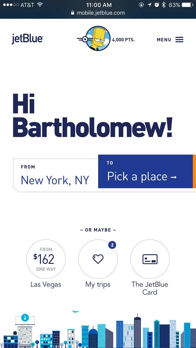
The initial concepts for an updated look and feel combined large, friendly typography with simple illustrations and fluid motion to create a new visual language for JetBlue’s digital presence.
HIIIIII
We proposed a radically stripped-down homepage, keeping booking front and center, while providing space to promote vacations and other featured content in a more visual, less salesy way. Secondary navigation on the page is dynamic and contextual, surfacing relevant actions based on what’s known about the user’s history and current state.
dynamic navigation, real-time travel updates & MORE
the goal was simple: make flying feel smoother, smarter, and less like a chaotic sprint to the gate.
Tons of animation tests and prototypes were created to incorporate motion throughout the site..
A high-fidelity prototype for a day-of-travel concept for the JetBlue app - giving flyers the most contextually relevant information at the right time, while providing a simple visual progress bar of the trip that can be followed by friends & family
VISUALIZING TIME
In this concept, the “travel ribbon” serves as an elegant metaphor for the entirety of the trip, and becomes a flexible infographic that can be used to show relevant times, delays, layovers and connecting flights in an intuitive visual timeline.
The aim was to reduce stress on the day of flight by making the milestones along the ‘travel ribbon’ clear and understandable in a super visual way.
Bringing some personality and calm to the in-flight entertainment system.


